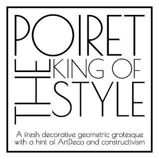
A fresh decorative geometric grotesque with a hint of Art Deco and c‘onstructivism. Poiret One is a unique typeface with light forms and pure elegance. Sleek and simple. Based on geometric forms, it has stylish lines and graceful curves. The font is applicable for large signs, labels, titles, headlines and any type of graphic design on the web, in motion graphics, or in print - from t-shirts to posters and logos. It is also well-suited for short texts and advertising where style is desired. Complete with a lower-case letters, the Poiret One is also useful for all-caps usage.
Sans Serif Fonts
Thursday 26 April 2012
Point to Poirot
A fresh decorative geometric grotesque with a hint of Art Deco and c‘onstructivism. Poiret One is a unique typeface with light forms and pure elegance. Sleek and simple. Based on geometric forms, it has stylish lines and graceful curves. The font is applicable for large signs, labels, titles, headlines and any type of graphic design on the web, in motion graphics, or in print - from t-shirts to posters and logos. It is also well-suited for short texts and advertising where style is desired. Complete with a lower-case letters, the Poiret One is also useful for all-caps usage.
Veneer Font
Veneer from Yellow Design Studio
is a high resolution hand-crafted letterpress font that’s vintage and
authentic with a touch of grunge. It’s highly customizable with six
distress options for every letter and three for all other characters,
and because it’s remarkably detailed, it looks great even at very large
sizes. In addition it includes a matching set of funky extras…for free!
The Veneer family includes Veneer, Veneer Two, and Veneer Three with Veneer containing the least distressed characters and Veneer Three the most. Mix and match as desired to create realistic letterpress type.
Veneer is available in cross-platform Opentype/Truetype format, compatible with all operating systems including Mac, Windows, and Linux. Because of Veneer’s high level of detail, it may process more slowly in some applications.
Everything is going to be alright
.jpg)
Alright Sans is a contemporary sans-serif with a clean, prudent voice that avoids looking stiff or bland. Actually, it has just the right amount of warmth to convey a serious-yet-friendly tone. It has an open structure with shorter-than-normal capitals and a large x-height, giving it a roundabout economy that works exceptionally well across all media, in both large and small sizes. It’s extensive character set, rich OpenType features, and wide range of weights makes it a reliable and versatile workhorse.
Spider Type
Spider Type is a handmade eps font. The project was made guide of
helvetica-bold and it is free for personal and commercial use.
My biggest fear is spiders but I have to admit, this font is pretty cool.
My biggest fear is spiders but I have to admit, this font is pretty cool.
Typography in Ice
Really neat way to showcase this font, Trump Gothic. The designers, YouWorkForThem, literally froze the type face which turned out really cool, adding natural texture to the font rather than using computer generated textures. Which don't always look appealing.
Check it out.
Check it out.
Earth Font???
Rhett Dashwood has spent his spare time from October 2008 to April 2009 searching Google Maps in hopes of discovering land formations and buildings resembling letterforms. These are the typographic landscapes he has spotted in Victoria, Australia. Rhett works as the Director of Wade in Melbourne, Australia and is the founder of the online creative resource Heavy Backback.
More than meets the eye
His experimental typographic project “The Depth of Typography” challenges the assumption that type is flat and only viewed from a single vantage point. His glyphs bend and twist through space, creating abstract sculptural forms. However, when viewed from face on the traditional typographic form is maintained.
Subscribe to:
Posts (Atom)


